Galaxy S24 / S24+ / S24 Ultra review: 4 amazing things that you can do with Galaxy AI (first look) [video] Reviews
TECH Epson Philippines Sponsors Metro Manila Elementary Schools With Innovative Technology to Enhance LearningEpson Philippines Sponsors Metro Manila Elementary Schools With Innovative Technology to Enhance LearningMVRK Simulations, ROC PH named as winners of DTI’s IDEA and ADVanCE for Creatives ProgramsMVRK Simulations, ROC PH named as winners of DTI’s IDEA and ADVanCE for Creatives Programs STYLE Say Aloha to the NEW Kenny Rogers Roasters’ Hawaiian RoastSay Aloha to the NEW Kenny Rogers Roasters’ Hawaiian RoastSlow Fashion: Keeping IP Culture AliveSlow Fashion: Keeping IP Culture Alive MEDIA Chinese Pop Artist XIN LIU Releases Debut English-Language Song “REALITY”Chinese Pop Artist XIN LIU Releases Debut English-Language Song “REALITY”Lay Zhang Drops New Single “Psychic”Lay Zhang Drops New Single “Psychic” REVIEWS vivo V30 review: Perfect for content creatorsvivo V30 review: Perfect for content creatorsRedmi Note 13 Pro+ 5G XFF Edition review Redmi Note 13 Pro+ 5G XFF Edition review UGREEN Nexode RG review: The cutest charger, ever! UGREEN Nexode RG review: The cutest charger, ever! Infinix HOT 40 review: Budget-friendly powerhouse Infinix HOT 40 review: Budget-friendly powerhouse OPPO Reno11 5G review OPPO Reno11 5G review TECNO POVA 6 Pro 5G review: The budget gaming king of 2024?TECNO POVA 6 Pro 5G review: The budget gaming king of 2024? EVENTS ICYMI: TechLife and realme turn up the heat at the Clark Aurora Music FestivalICYMI: TechLife and realme turn up the heat at the Clark Aurora Music FestivalCOAllective 2024 by Council of Organizations of the Ateneo – Manila (COA-M) [event]COAllective 2024 by Council of Organizations of the Ateneo – Manila (COA-M) [event]Abot-kayang gadget, appliance deals this summer from Home Credit [deals]Abot-kayang gadget, appliance deals this summer from Home Credit [deals]vivo V30 Series official Philippine launch [event]vivo V30 Series official Philippine launch [event]Parokya Ni Edgar rocks the crowd at Bagsakan ConcertParokya Ni Edgar rocks the crowd at Bagsakan ConcertLEADCon 2024 [event]LEADCon 2024 [event]
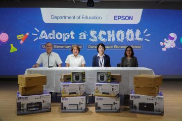
TechnologyEpson Philippines Sponsors Metro Manila Elementary Schools With Innovative Technology to Enhance Learning
Lifestyle, TechnologyMVRK Simulations, ROC PH named as winners of DTI’s IDEA and ADVanCE for Creatives Programs
EntertainmentMigs Bustos Goes On A Foodtrip In UST’s Famous Summer Delight Spots On ‘MY PUHUNAN: KAYA MO!’
![realme 12 Pro+ 5G review: The best camera phone under P30K [video]](https://astig.ph/wp-content/uploads/2024/03/relme-12-Pro-5G-vs-Galaxy-S24-Ultra-with-price-768x450.jpg "realme 12 Pro+ 5G review: The best camera phone under P30K [video]")

![Galaxy S24 / S24+ / S24 Ultra review: 4 amazing things that you can do with Galaxy AI (first look) [video]](https://astig.ph/wp-content/uploads/2024/01/Galaxy-S24-S24-S24-Ultra-review-4-amazing-things-that-you-can-do-with-Galaxy-AI-first-look-768x450.jpg "Galaxy S24 / S24+ / S24 Ultra review: 4 amazing things that you can do with Galaxy AI (first look) [video]")


![COAllective 2024 by Council of Organizations of the Ateneo - Manila (COA-M) [event]](https://astig.ph/wp-content/uploads/2024/03/433462946_935677181894306_3876325270876989630_n.jpg)
![Abot-kayang gadget, appliance deals this summer from Home Credit [deals]](https://astig.ph/wp-content/uploads/2024/03/Summer-KV_PR-Stories_1980x1020-1.jpg)
![vivo V30 Series official Philippine launch [event]](https://astig.ph/wp-content/uploads/2024/03/vivo-V30-Series-Grand-Launch-1.jpg)

![LEADCon 2024 [event]](https://astig.ph/wp-content/uploads/2024/03/432521965_928199485975409_6374789088711358625_n.jpg)